
In today’s fast-paced digital world, accessibility isn’t a luxury—it’s a necessity. Creating an accessible digital experience means designing websites that every user can navigate and enjoy, regardless of their abilities or the device they use. This article dives deep into the CalOptima project, where I led a transformation that brought a modern, mobile-first, and inclusive design to a vital public service website. This case study highlights my process, challenges, and the measurable impact of embracing accessibility as a core design principle.

Project Background and Challenges
CalOptima serves thousands of visitors daily, including members, providers, and community stakeholders. When I joined the project as the UX/UI and Frontend Development Lead, I encountered a website that had grown outdated over nearly a decade. Users struggled with disorienting navigation, clunky interfaces, and a lack of mobile optimization. Many visitors, particularly those who relied exclusively on their smartphones, found it difficult to access essential information.
The project goal was clear: create a fluid, modern, and intuitive website that adapts seamlessly across devices while delivering information in multiple languages. The challenge was to transform an old platform into one that not only meets today’s standards but also exceeds user expectations by making digital content accessible to everyone.
My Role and Strategy
Leading the Transformation
As the UX/UI and Frontend Development Lead, I took charge of the project’s overall design and technical direction. I coordinated with the Project Manager to align our work with strict business requirements, ensuring that every sprint advanced our mission of inclusivity. I also built and managed a team of UX/UI contractors, hiring and training professionals who shared a passion for accessible design.
Embracing a Mobile-First Approach
One of the core challenges was that a significant portion of CalOptima’s audience accessed the website exclusively on mobile devices. I adopted a mobile-first design philosophy, meaning I designed the experience primarily for small screens before scaling up to larger displays. This approach forced us to prioritize clarity, simplicity, and easy navigation. Every element—from typography and color choices to layout and interactive components—was carefully crafted to perform flawlessly on mobile devices.
Inclusive Wireframing and Prototyping
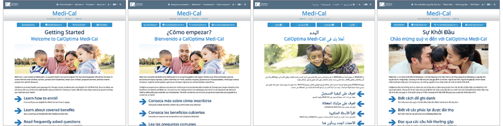
I began the project by sketching out wireframes and building interactive prototypes using Adobe XD. These prototypes focused on presenting information clearly and concisely while ensuring a logical site structure. I placed special emphasis on creating a design that could handle multiple languages. The layouts were built to effortlessly switch between seven threshold languages, ensuring that users from diverse linguistic backgrounds received an optimal experience.
Multi-Language Considerations
Accessibility extends beyond visual and navigational elements—it means ensuring that content is accessible to speakers of all languages. From the beginning, I made multi-language support a priority. I worked closely with the Cultural & Linguistics departments to integrate translations seamlessly into the design. Planning for variable text lengths and different reading directions allowed us to craft an experience that felt native and intuitive for all users.
Results and Impact
Improved Accessibility and Engagement
The transformation of the CalOptima website delivered significant, measurable results:
- Fully Responsive Design: By adopting a mobile-first approach, we created a responsive design that performs excellently on any device. This change directly addressed the needs of members who relied on mobile access.
- Multi-Language Support: Offering the website in seven languages removed language barriers, making critical information accessible to a more diverse audience.
- Reduced Customer Service Calls: A clearer, more intuitive design enabled users to locate information independently, resulting in a noticeable decline in calls to customer service.
- Increased Website Engagement: The streamlined navigation and accessible layout fostered a more enjoyable user experience, driving steady growth in overall website engagement.
Key Learnings
Working on the CalOptima project reinforced several essential principles of accessible digital design:
- Mobile-First Mindset: Prioritizing mobile design is crucial for reaching users who depend on smartphones for internet access. This approach ensures that the design is simple, clear, and efficient.
- Design Thinking: Explaining design decisions in straightforward, non-technical language is key to aligning stakeholders and team members. This clarity smooths the development process and accelerates project delivery.
- Compliance as a Catalyst for Innovation: Meeting regulatory requirements, such as those outlined in Section 508, drove us to innovate. Compliance wasn’t a constraint—it spurred creative problem-solving that enhanced the overall user experience.
- Collaboration and Teamwork: The project’s success hinged on effective collaboration across multiple teams. By uniting diverse expertise—from development to content creation—we achieved a unified approach to accessible design.

Best Practices for Designing Accessible Digital Experiences
Based on my experience with the CalOptima project, here are some best practices for creating accessible digital experiences:
- Adopt a Mobile-First Approach: Start by designing for mobile devices. This forces you to focus on simplicity, clarity, and efficient navigation.
- Develop Clear Wireframes and Prototypes: Use tools like Figma to create detailed designs and prototypes. Testing these designs early with real users can provide valuable feedback and guide improvements.
- Plan for Multi-Language Support: Ensure that your design accommodates multiple languages by considering flexible layouts, adaptable typography, and appropriate spacing.
- Implement a Robust Testing Strategy: Test across different devices, browsers, and languages. Incorporate compliance audits to verify that your site meets all relevant accessibility standards.
- Collaborate Effectively: Work closely with project managers, developers, and content teams. Clear, continuous communication is essential for overcoming challenges and achieving a successful project outcome.
- Iterate and Improve: Accessibility is an ongoing process. Continually gather user feedback and refine your design to keep pace with evolving standards and user needs.
Conclusion
The CalOptima project stands as a testament to the power of accessible digital design. By embracing a mobile-first approach, prioritizing multi-language support, and implementing a robust testing strategy, we transformed an outdated website into an intuitive, engaging, and inclusive digital experience. The results are clear: reduced customer service calls, increased user engagement, and a platform that truly serves a diverse community.
This case study demonstrates that accessible design is not only about meeting regulatory requirements—it’s about enhancing user experience and driving engagement. I remain passionate about creating digital experiences that welcome every user and believe that accessible design is a key driver of long-term success.