AERIS BY IROBOT | E-commerce UX Strategy
Rebranding and scaling an e-commerce experience to drive conversion and brand trust
Problem: Aeris needed a post-acquisition rebrand + conversion uplift on a legacy e-commerce platform under a fixed seasonal deadline.
What I Owned: End-to-end UX direction for the redesign (IA/navigation, key flows, UI quality), alignment, and delivery QA (hands-on).
Constraints: 6-week launch window, legacy codebase, global brand requirements, accessibility/performance, distributed team.
Artifacts shipped: Navigation + IA model, high-fidelity UI + prototypes, cart/checkout recommendations, specs + QA checks.
Results: +25% checkout completion, reduced cart abandonment, WCAG improvements, faster delivery via reusable patterns.
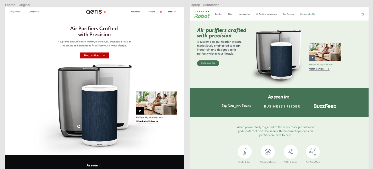
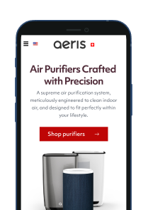
Transformation of the Aeris by iRobot e-commerce website.
Problem Statement
Aeris needed a brand-driven redesign that improved trust and conversion while shipping on a 6-week timeline across a legacy e-commerce stack.
The Challenge
Legacy e-commerce platform required a full redesign without breaking purchase flows.
Rebrand needed consistent UI patterns across templates and surfaces.
Accessibility and performance work had to land without delaying launch.
What I Owned
Set UX direction and success metrics for the redesign aligned to business OKRs (conversion, abandonment, trust).
Defined the navigation + IA model and redesigned key flows (browse → cart → checkout) to reduce friction.
Delivered high-fidelity UI, prototypes, and engineer-ready specs; partnered through QA to ensure shipped quality.
Led accessibility + performance audits and translated findings into prioritized fixes for launch.
Aligned Product, Brand, Legal, and Engineering on tradeoffs and final decisions across time zones.
Decision Snapshots
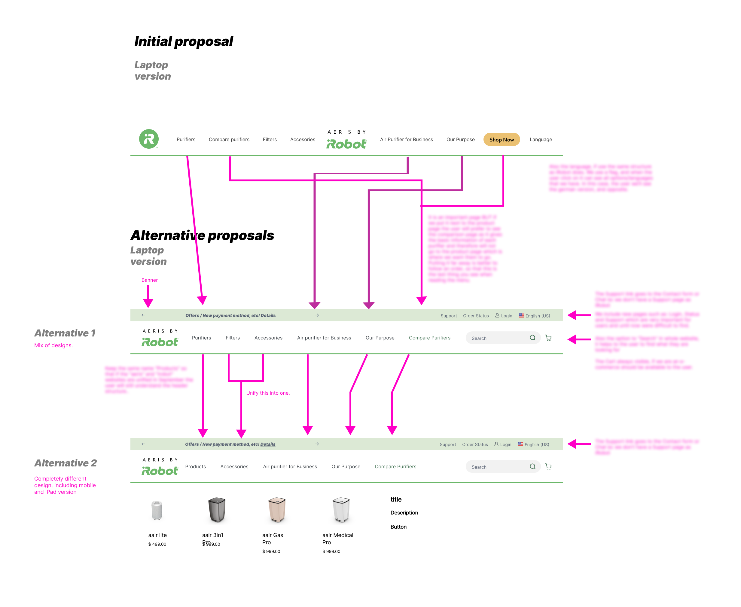
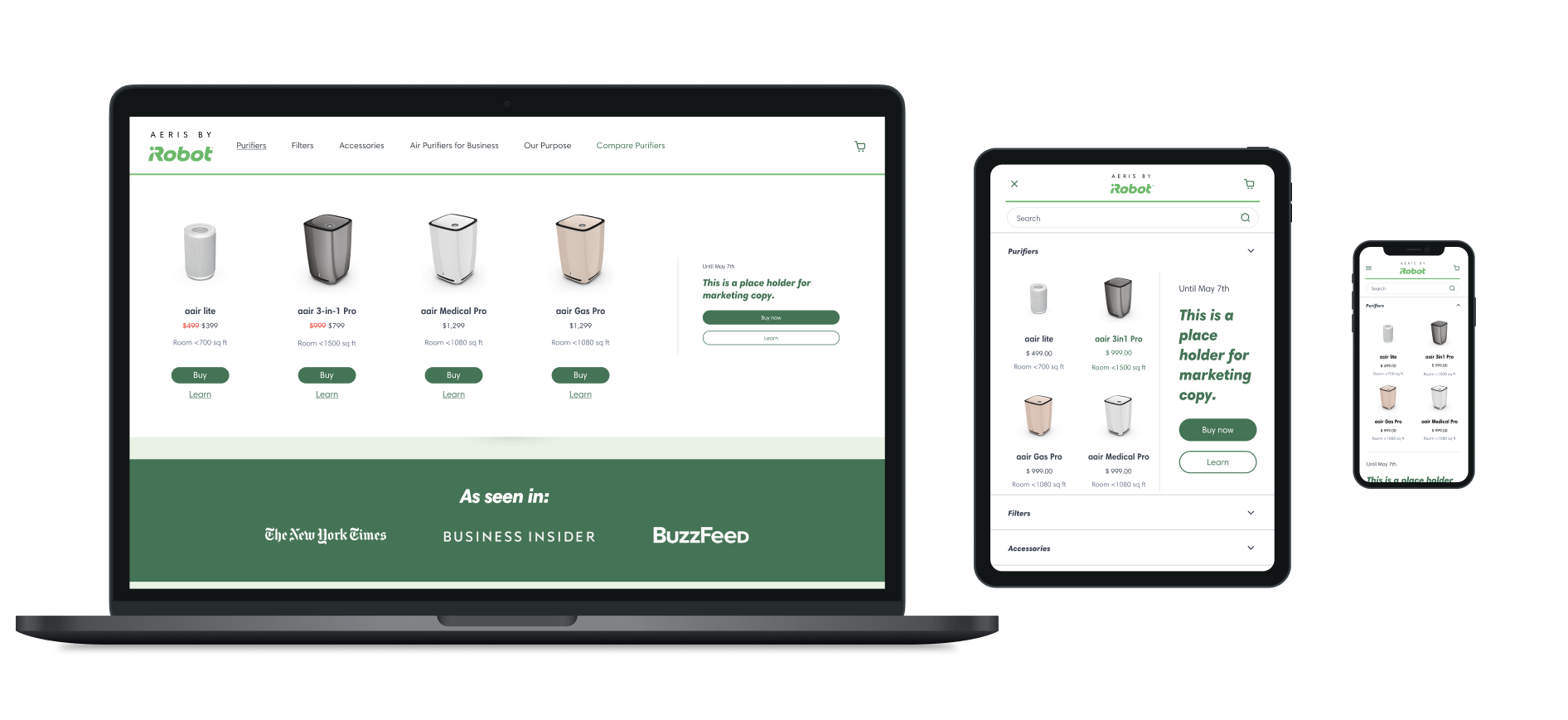
Navigation: prioritized task-based paths (“Buy / Compare”) over brand-led browsing to reduce time-to-product.
Cart: surfaced bundled recommendations without interrupting checkout intent (kept purchase CTA dominant).
Performance: targeted highest-impact template weight + image loading changes to protect conversion under seasonal traffic.
Accessibility: standardized interactive states + contrast rules to reduce late-stage remediation.
Optimizing the E-Commerce Experience
As the Aeris product transitioned under iRobot, I identified critical UX debt in the site’s primary navigation and product catalog layout. These pain points were disrupting the buyer journey and impacting conversions. Rather than approaching the redesign as a visual update, I positioned it as a strategic intervention to align business goals, product discoverability, and conversion paths across devices. With a tight timeline, I aligned stakeholders around a common goal: reduce friction and make it easier for customers to buy.
Key Decisions & Outcomes:
Simplified the buyer journey by redesigning the navbar to prioritize essential paths like “Buy” and “Compare Purifiers,” removing distractions and repetitive elements.
Improved conversion by streamlining key CTAs and surfacing product education earlier in the flow, leading to a measurable 25% lift in conversions.
Led multi-stakeholder alignment across UX, brand, and engineering, balancing iRobot’s global design requirements with Aeris’s legacy codebase and technical constraints.
Validated UX changes through annotated prototypes, task analysis, and clear design recommendations that ensured clarity across dev handoff, even in a cross-time-zone environment.
Demonstrated product thinking by linking visual clarity to business impact, focusing on removing friction in the cart funnel during a high-stakes seasonal relaunch.
Outcomes & Impact

Higher Conversions
25% lift in conversion rate after launch through improved flows and performance

Reduced Cart Abandonment
Streamlined shopping experience directly lowered abandonment rates

WCAG 2.1 AA Compliance
Strategic updates brought the site into WCAG alignment, expanding usability

Accelerated Delivery
Reusable components and design tokens cut future design/dev time by ~30%
Measured via conversion + abandonment analytics during the seasonal launch window; accessibility validated on core templates/components.
Let’s Connect
I steer organizations toward scalable, user-centered design by combining strategic leadership, systems thinking, and practical, hands-on partnership.
Reach me at rudy [at] rudyland dot com or via LinkedIn.